Project Overview
College Connect, developed by Siembra Mobile, is a free educational technology platform and mobile application designed to improve college access and career readiness for students.
The project involved a comprehensive UX/UI redesign of both the existing mobile application and web portal, with a focus on improving accessibility, modernizing the visual experience, and creating a more polished, professional, and engaging user interface. The goal was to enhance usability while aligning the product with current design standards and best practices.
My Contributions
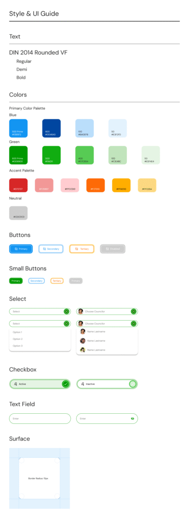
I was brought in as the UX/UI lead and Figma specialist to translate project requirements into high-fidelity designs, establish a cohesive design system, and create a consistent visual language across both the mobile application and web portal. Working closely with stakeholders and developers, I transformed business and user requirements into intuitive, user-centered experiences that balanced functionality, accessibility, and visual appeal.
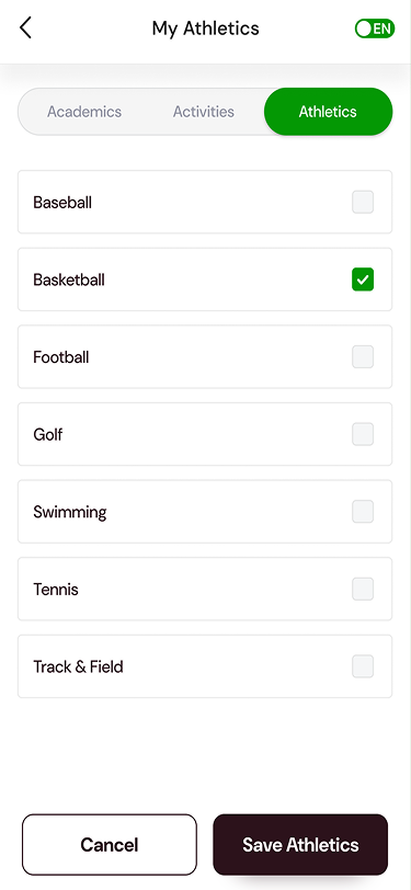
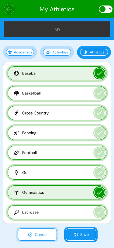
Mobile-First
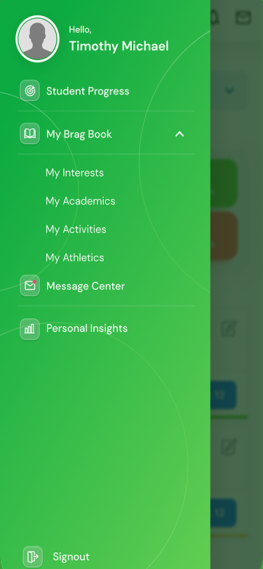
Both the mobile application and web portal had evolved over time as new features were added, resulting in an inconsistent user experience and a visual design that no longer reflected the maturity of the product or the evolution of the Siembra Mobile brand. Using a mobile-first approach, I streamlined workflows, improved information hierarchy, and created a unified design system across platforms. The redesign introduced modern visual standards, improved accessibility, and more consistent interaction patterns, resulting in a cohesive, intuitive experience that better aligned with the organization’s mission and brand.
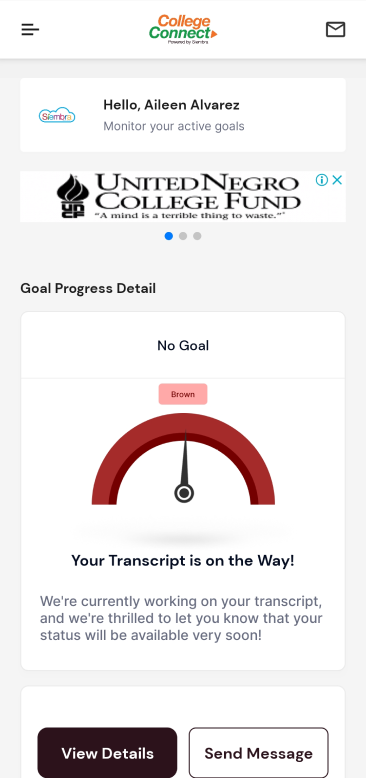
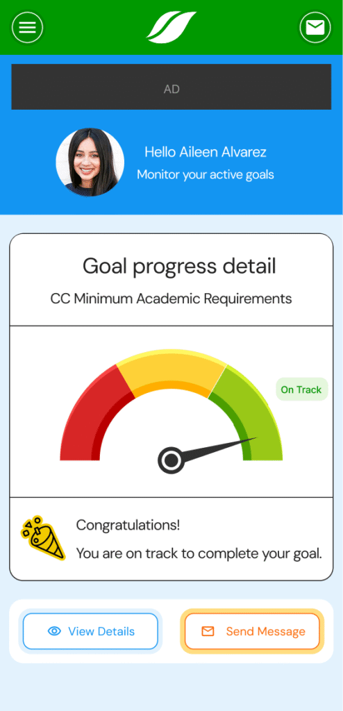
One of the client’s key requirements was the extensive use of custom iconography throughout the platform. The goal was to create a more engaging and approachable experience, moving away from a purely utilitarian interface. Custom icons were used to reinforce the brand identity, improve visual hierarchy, and make content and functionality easier for users to scan and understand.
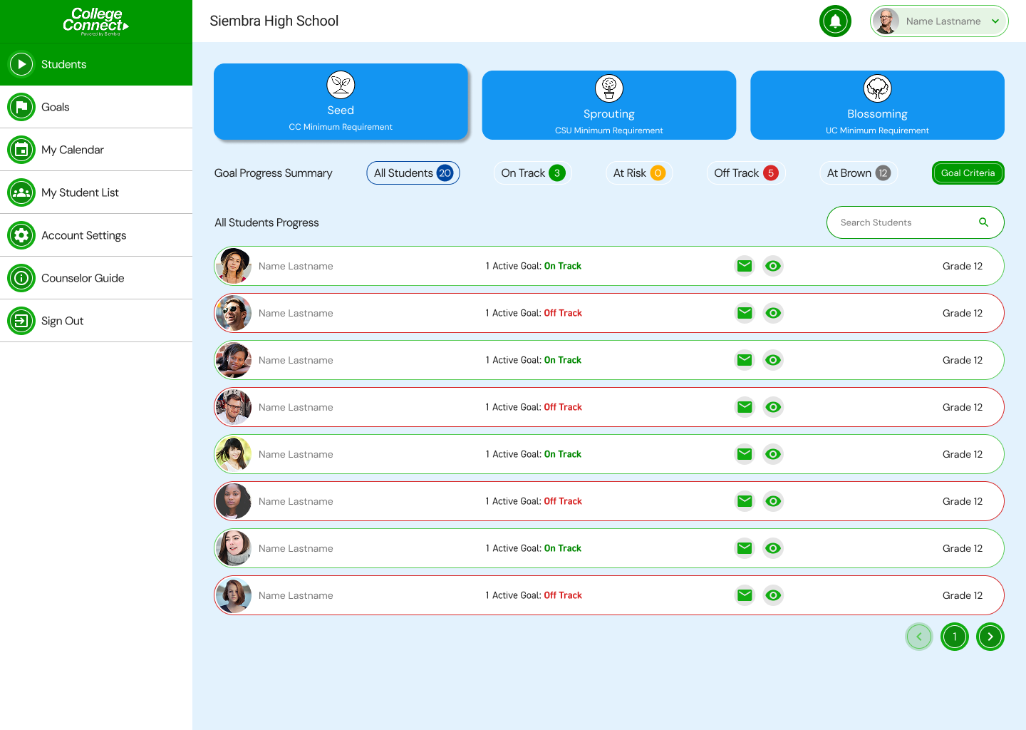
Desktop Portal
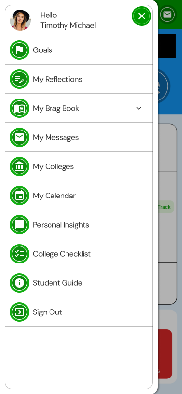
While the mobile app was primarily designed for students, the web portal served multiple user groups, including students, parents, and school administrators. Despite these differing needs and workflows, the portal largely mirrored the mobile app’s interface and design patterns. The redesign addressed this by adapting the experience to better support the unique requirements of each user group while maintaining a consistent visual language across platforms.
Outcome
The outcome was highly successful, resulting in a cohesive and modern experience across both the mobile application and web portal. The redesigned interface established a clear and consistent visual language, improved usability and accessibility, and better aligned the product with the evolving Siembra Mobile brand. By creating a unified design system and tailoring experiences to the needs of different user groups, the platform became more intuitive, engaging, and scalable for future growth. The client was extremely pleased with the results, and the redesigned experience was well received by stakeholders, developers, and end users alike.